
PHOTOSHOOT / ART DIRECTION
Regions Wealth Photoshoot
Brief
Luckie was asked to create a gallery of custom photography for Regions Wealth Management and Private Wealth Management lines of business.
These images will need to be used across a variety of mediums, platforms, and subject matter.
Overview
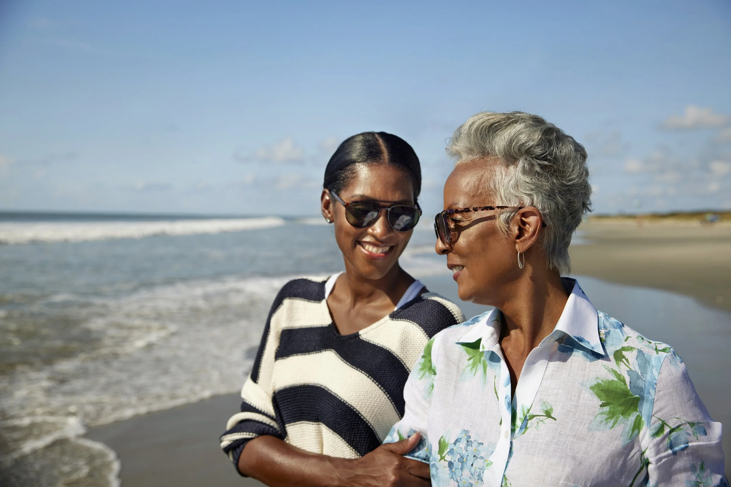
This campaign illustrates a modern depiction of wealth and rising net worth with a strategic approach to the use of imagery.
Imagery for the Regions Wealth Management business group feels sophisticated yet attainable, and never cold or unemotional. The LifeGreen and True Titanium colors are infused into the images in a natural way through settings, wardrobe and props. The images feel like genuine captured moments in time – never staged or overtly posed.
Created at Luckie & Company
Art Direction/Designer: Victoria Olinger
Photographer: Ryan Hayslip
Associate Creative Director: Allison Corbin
Production Director: Lizzie Holt
Wardrobe: Alexandra Munzel
Location: Mt. Pleasant, SC / Isle of Palms, SC

Finalized Shotlist
First Home Location
Middle aged couple looking at laptop/finances
Middle aged couple preparing meal together
Couple entertaining friends/hosting dinner party
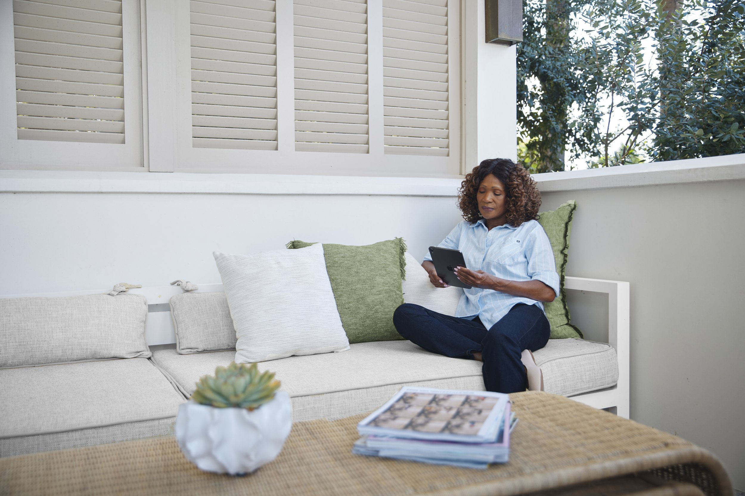
Woman looking at her phone/Man looking at a tablet (would like several set ups of this with different talent)
Woman reading in backyard
Senior man sorting through and organizing fishing/boating gear
Man looking out over balcony
Taking a book off of the shelf in hallway or office
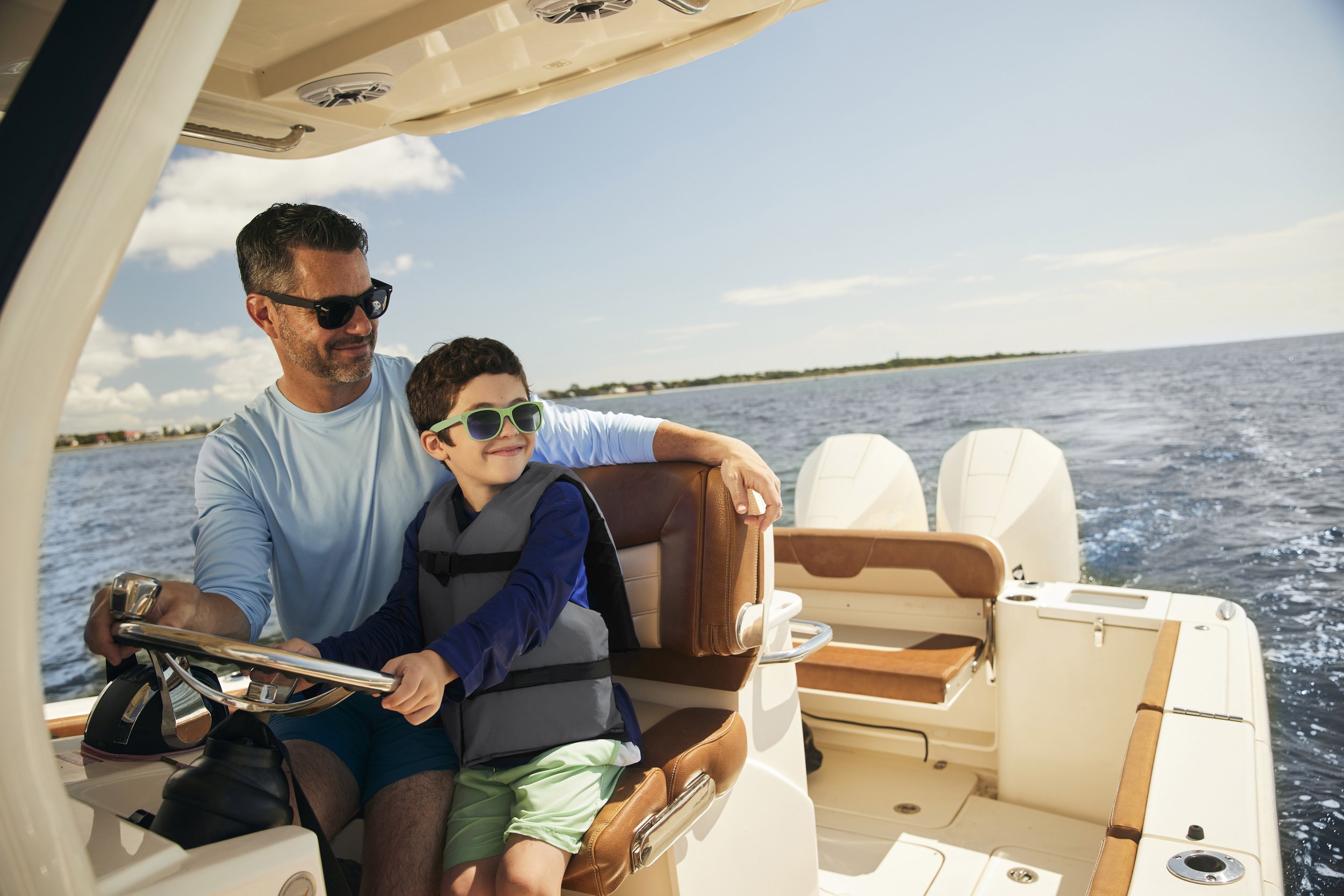
First Home Location/Boat
Man/woman opening door, welcoming advisor inside
Female advisor talking to female client
Couple making plans with advisor
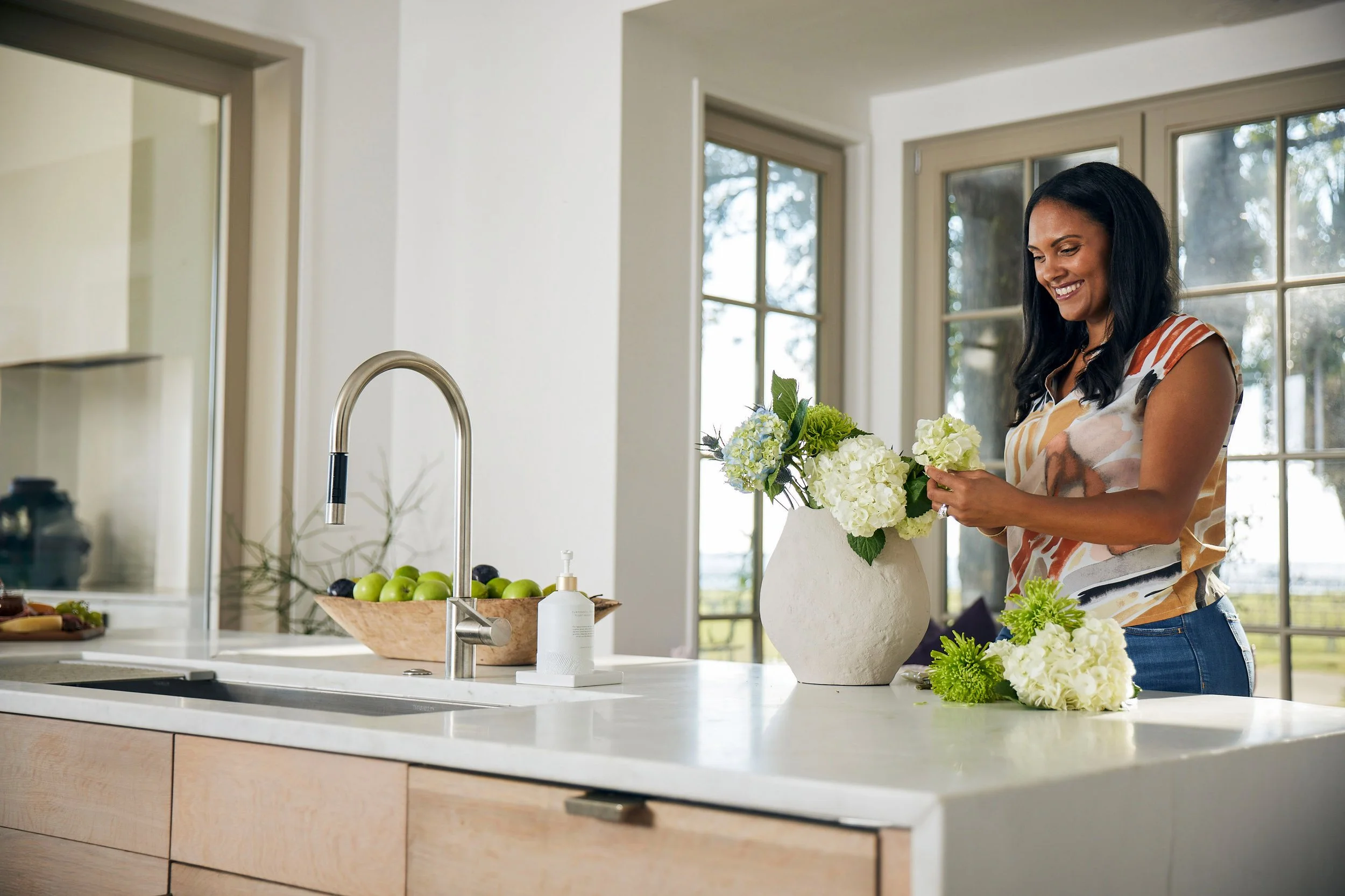
Couple in house
Children swim as parents watch from boat
Middle aged woman at steering wheel, looking ahead
Jumping off of boat
Couple sitting together on boat
Grandfather teaching child to fish
Outdoor
Woman taking photos; she is learning how to use camera
Couple hiking in nature
Multi generational family walking on shoreline together
Man or woman surfing/kayaking
Couple walking on shoreline
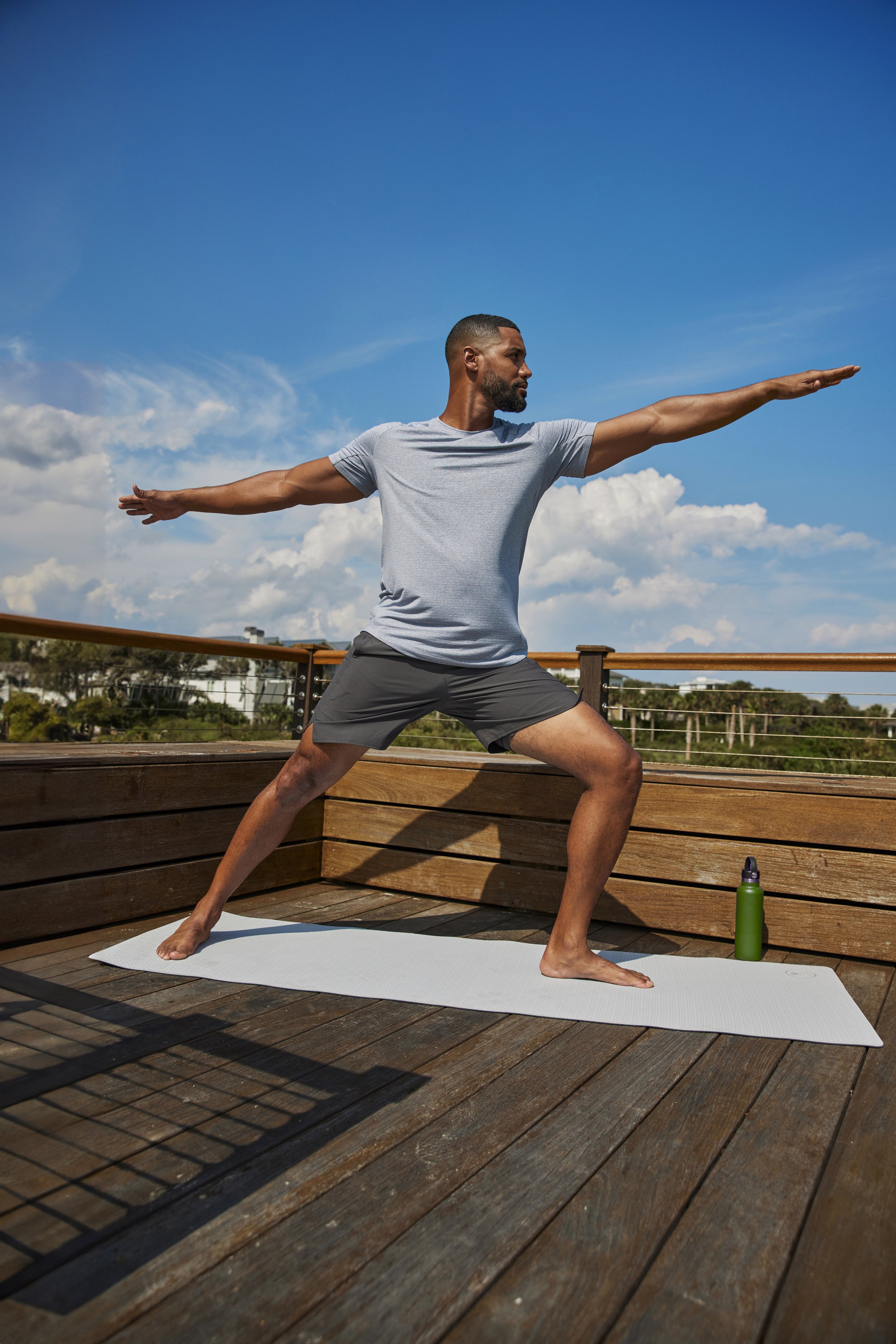
Man doing yoga
Family at pool
Family time by the fire pit
Women talking with each other on porch


We utilized a total of three locations to deliver 41 final images in addition to the entire gallery of photos.
We needed to utilize space in creative ways to maximize differentiation in the library of images. We also needed to ensure that no crossover occurred within our “family” of casting, meaning that if one location within the space was used for a specific “grouping/family” of talent, it could not be repeated in another image depicting a different “grouping/family” of talent. By doing this, we successfully avoided continuity discrepancies within our custom library of images to convey the idea that we had far more locations than we did.
All 6 images to the right were photographed in the same location.


Diversity of age, gender, race was very important for client during this project. We were able to work with a total of 29 talent including 22 adults male/female ranging in ages from 28-71, 5 children, and 2 adorable dogs.
However, due to the limited locations and budget constraints of this campaign, we needed to think creatively and outside of the box in how we approached casting and locations.
Each of our talent needed to be placed with a plausible family combination. With this many talent, it can create a delicate web of dominoes if someone falls through due to unavailability on shoot day.
Our couples, singles, families, wealth advisors, and friends, needed to stay within the roles we assigned them. After all, we weren’t just taking pictures, we were creating a world. Why endeavor to create a custom photo library, if you don’t go above and beyond in creating the “characters.”
I used a combination of letters, numbers, and colors to create an organizational system that corresponded to our shot list while ensuring our “family units” were photographed together and we didn’t mix any families up if one were to view the library in its entirety.
See organizational process of building our casting to the right.


I also got the opportunity within this campaign to flex, learn, and grow my photoshop skills.
Some of the photoshopping included altering colors of objects to infuse our brand colors into the images in even more ways than we did practically on set, while other changes involved moving people/pets to other parts of the image or extending the images horizontally and vertically for specific placements for media.
Just a few examples to the right.

Original
Original
Original
RetouchedReplaced dog (from a different photo, increased saturation, brought up shadows, altered clothing colors
RetouchedReplaced dog (from a different photo, brightened photo, moved grandparents closer to rest of family, cleaned up beach
RetouchedReplaced plant, removed distracting architectural objects, made sky blue